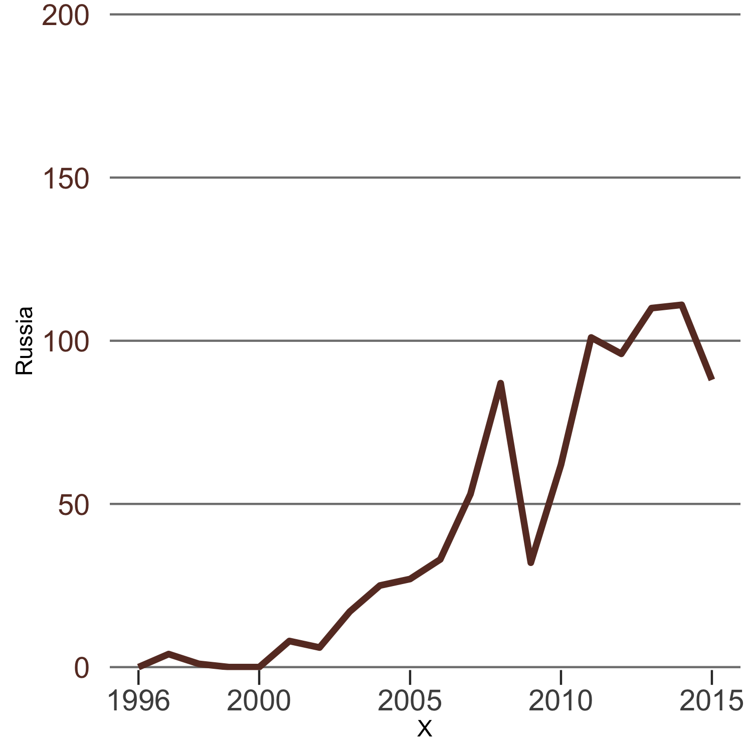
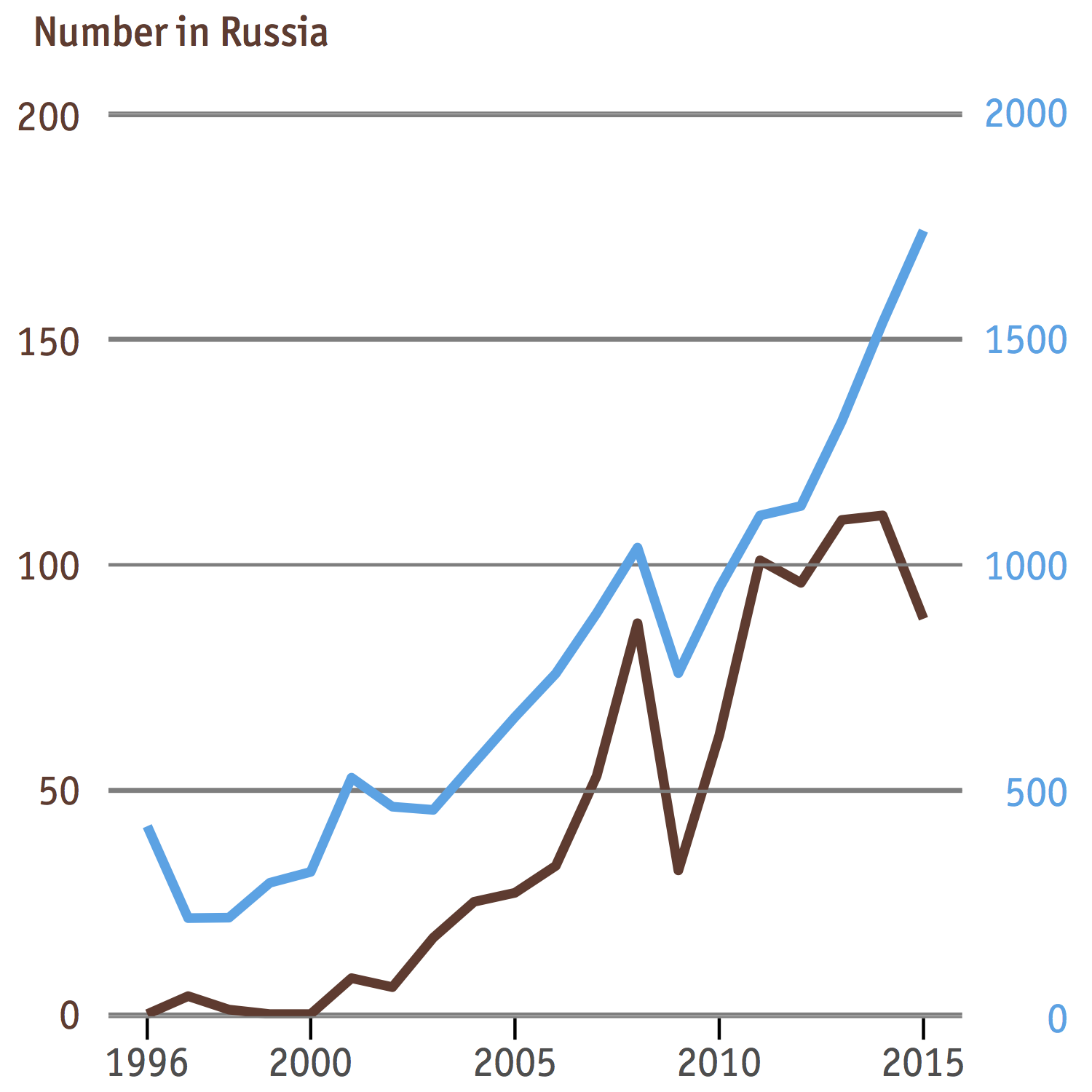
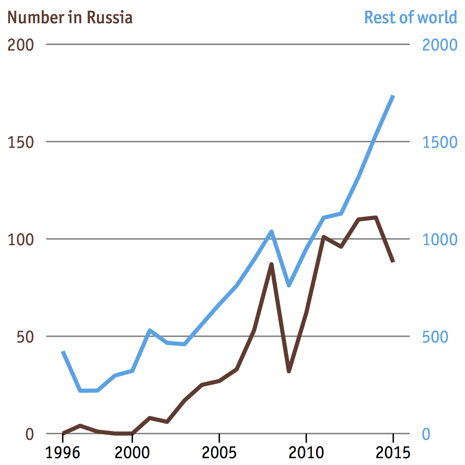
I’m a big fan of fancy charts and infographics, and The Economist’s daily chart is my favorite stop for data porn. They know how to visualize data sets in compelling ways that attract readers’ attention but still communicate the message effectively. For example, this chart shows how the number of Russian billionaires and those in the rest of the world have changed since 1996.

I typically don’t like charts with two y-axes because they are hard to read, but this one is an exception because the two axes, though in different scales, measure the same thing - number of people. And as with any pretty charts or graphs, let’s see if we can reproduce it. In this post I’m going to demonstrate how to do this entirely within R using the excellent ggplot2 package.
Why ggplot2?
An important point to note before we start: this is not the most efficient way to recreate this chart. The base R graphics can do the job fairly quickly, and you may even get a faster result with a combination of R and Illustrator, or whatever graphical design software you have. I choose ggplot2 simply because I’m curious to see what it’s capable of and how far we can stretch it.
In theory it’s not possible to construct a graph with two y-axes sharing a common x-axis with gglot2, as Hadley Wickham, the creator of this package, has voiced his utter and complete disapproval of such a practice. However there’s a hack around this by accessing and manipulating the internal layout of a ggplot at its most fundamental level using functions from the gtable package. While this sounds cool, this is still essentially a hack and may not work if the functions of ggplot2 undergo changes in the future. However, let’s not worry about this at the moment.
First attempt
Here’s the data that I have procured from the article on American Economic Review where this chart originates. As mentioned above, ggplot2 doesn’t support charts with two y-axes. But for the sake of demonstration, we’ll try nevertheless. For multiple data, the general approach is to melt the data to long format by using melt() from the reshape2 package:
library(reshape2)
library(ggplot2)

m.dat <- melt(dat, id="X")
ggplot(data=m.dat, aes(x=X, y=value, colour=variable)) + geom_line()
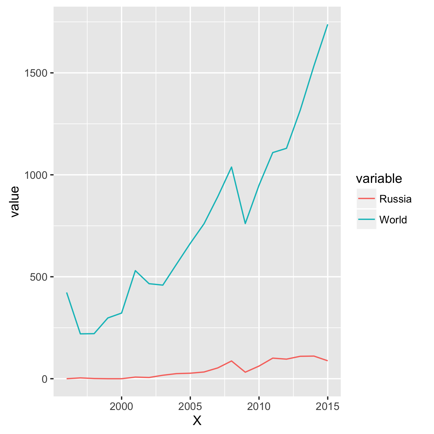
Well, not even close!
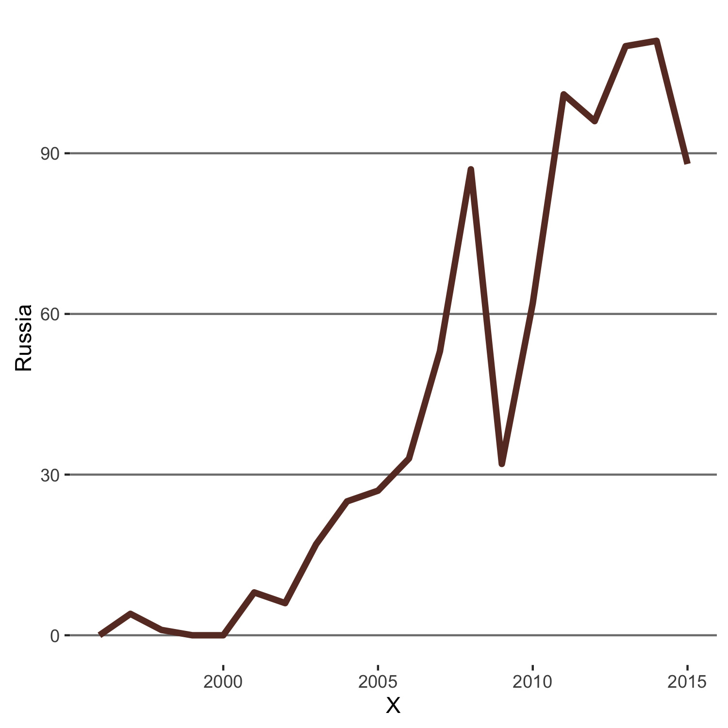
Let’s start by analyzing the components of the chart that we’re going to replicate. You can see the two groups of billionaires are distinguished by different colors. Let’s just call them brown and blue at the moment; later we’ll find out the exact hex number to reproduce these colors. Furthermore,
- Russian billionaires on the left y-axis: brown data line; brown axis title and axis labels but no vertical axis line.
- Non-Russian bilionaires on the right y-axis: blue for all items above, no vertical axis line either.
- Grey horizontal gridlines.
- No vertical gridlines.
- White background.
- Font: Officina Sans.
Now that we have identified the structure of the chart, here’s how we will go about making it
- Create a chart from Russian billionaires data, call it
p1. - Create another from rest-of-the-world billionaires data, call it
p2. - Combine
p1andp2.
Libraries and data
The first thing to do is load the data and libraries, as shown below
library(ggplot2)
library(gtable)
library(grid)
library(extrafont)

dat <- read.csv("billionaire.csv")
rus <- dat[,1:2]
world <- dat[,-2]
At the moment we only need to use ggplot2. As we proceed I’ll explain how the other packages come into play.
Create line plot for Russian data
Default line plot
To initialize a plot we tell ggplot that rus is our data, and specify the variables on each axis. We then instruct ggplot to render this as line plot by adding the geom_line command.
p1 <- ggplot(rus, aes(X, Russia)) + geom_line()
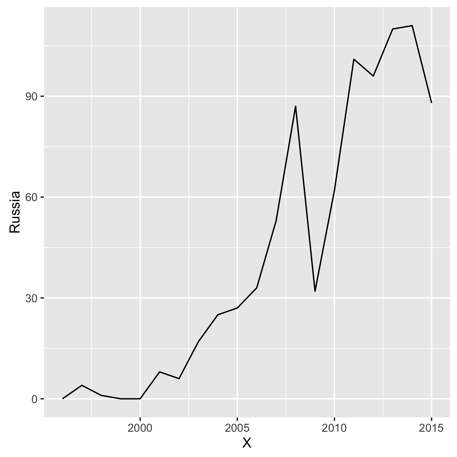
Compared this to the “brown” portion of the original chart, we’re missing a few elements. Let’s go figure them out one at a time.
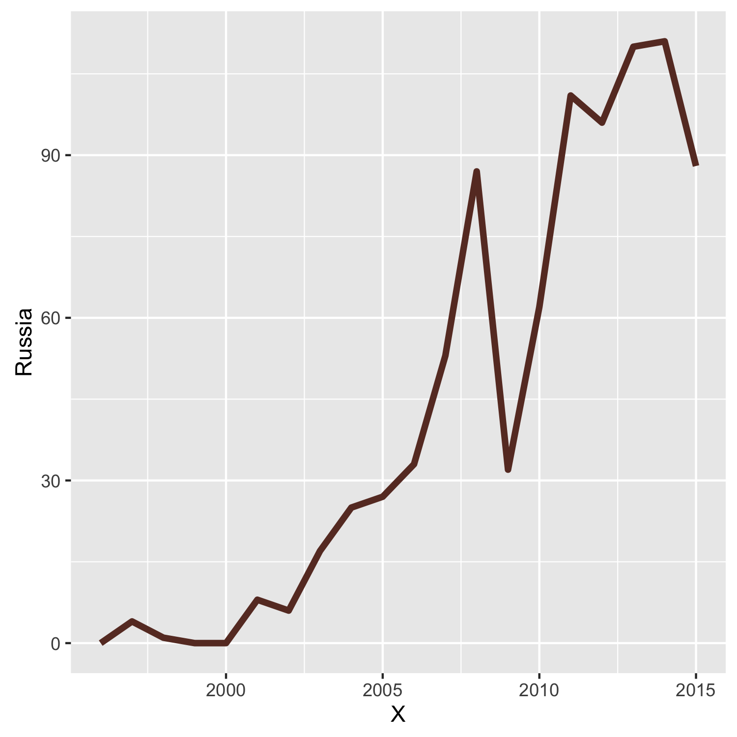
Line color and thickness
This can be done by specifying the correct parameters in geom_line:
p1 <- ggplot(rus, aes(X, Russia)) + geom_line(colour = "#68382C", size = 1.5)
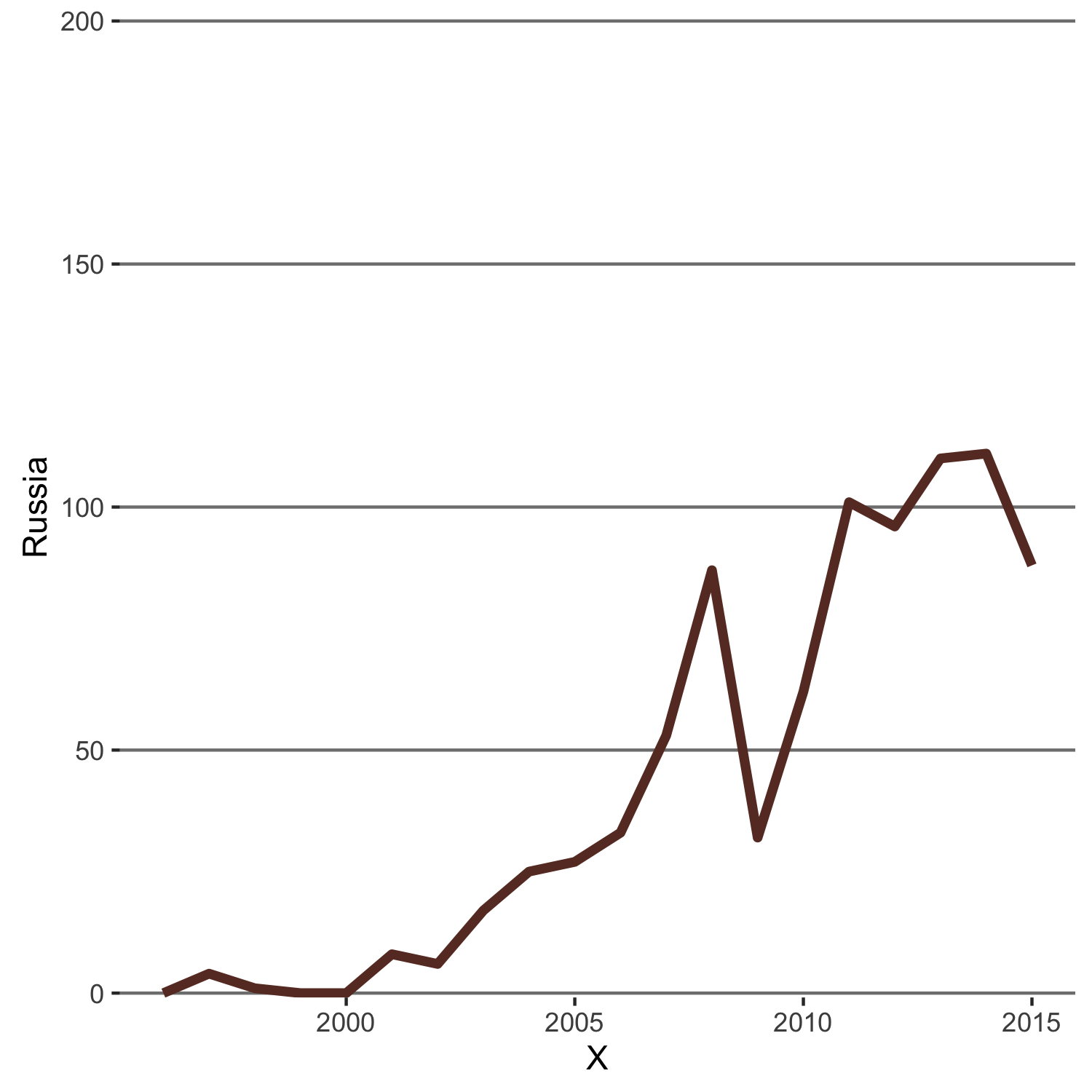
Gridlines
In ggplot2 there are two types of gridlines: major and minor. Major gridlines emanate from the axis ticks while minor gridlines do not. Thus we need to hide the vertical gridlines, both major and minor, while keeping the horizontal major gridlines intact and change their color to grey. Since gridlines are theme items, to change their apperance you can use theme() and set the item with element_line() or if you want to remove the item completely, element_blank().
p1 <- p1 +
theme(panel.grid.minor = element_blank(),
panel.grid.major = element_line(color = "gray50", size = 0.5),
panel.grid.major.x = element_blank())
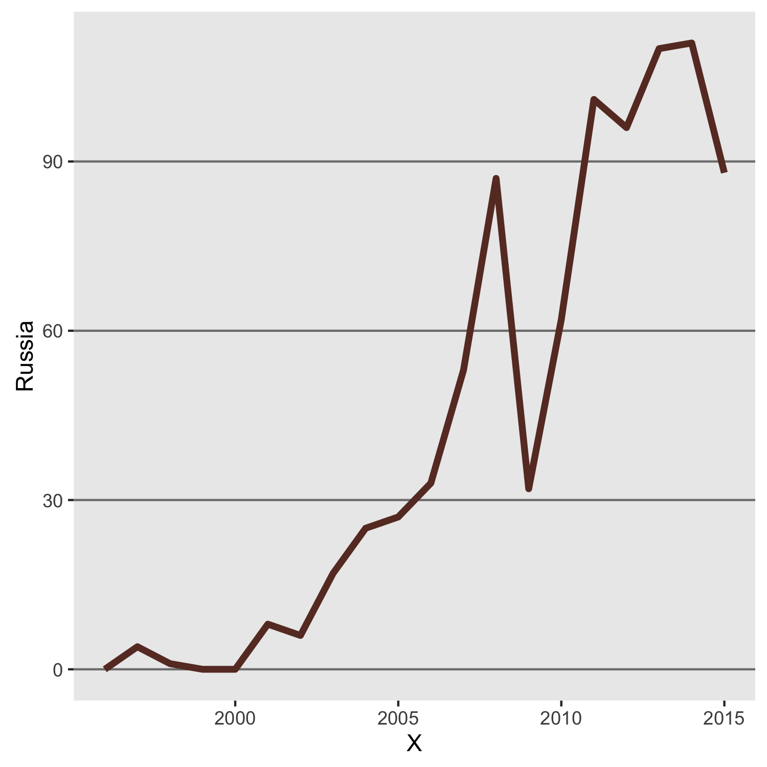
Background
Background coloring is controlled by panel.background, another theme element. Adding the following line will get rid of the default grey background:
p1 <- p1 + theme(panel.background = element_blank())
Y-axis scale
We will force the y-axis to span from 0 to 200 in increments of 50, as in the original chart by setting the limits in scale_y_continuous option. Note that there are some blank space between the x-axis ticks and the bottommost horizontal gridline, so we are going to remove it by setting expand = c(0,0) and limits. However, if we put limits = c(0,200) then the portion of the line representing the data points 0 will be partially obscured by the x-axis, so instead we set limits = c(-0.9,200.9) and pretend to be fine with the space that is much smaller now, but still there. Later you’ll see how to remove it completely.
p1 <- p1 + scale_y_continuous(expand = c(0, 0), limits = c(-0.9,200.9))
X-axis scale
The label indicating the year 1996 is missing from the x-axis. We will put it back by adding the scale_x_continuous option with the suitable parameters
p1 <- p1 + scale_x_continuous(breaks= c(1996, seq(2000,2015,5)))
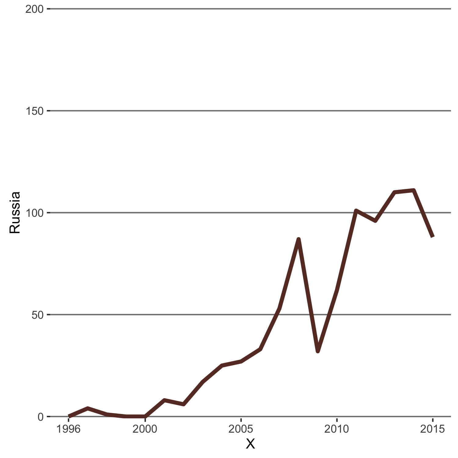
Axis texts (labels)
The text on both axes are a bit too teeny, and also the y-axis text has to be “brown” to match the color of the data line. We will change that by setting axis.text theme items with element_text().
p1 <- p1 +
theme(axis.text.y = element_text(colour="#68382C", size = 14),
axis.text.x = element_text(size = 14))
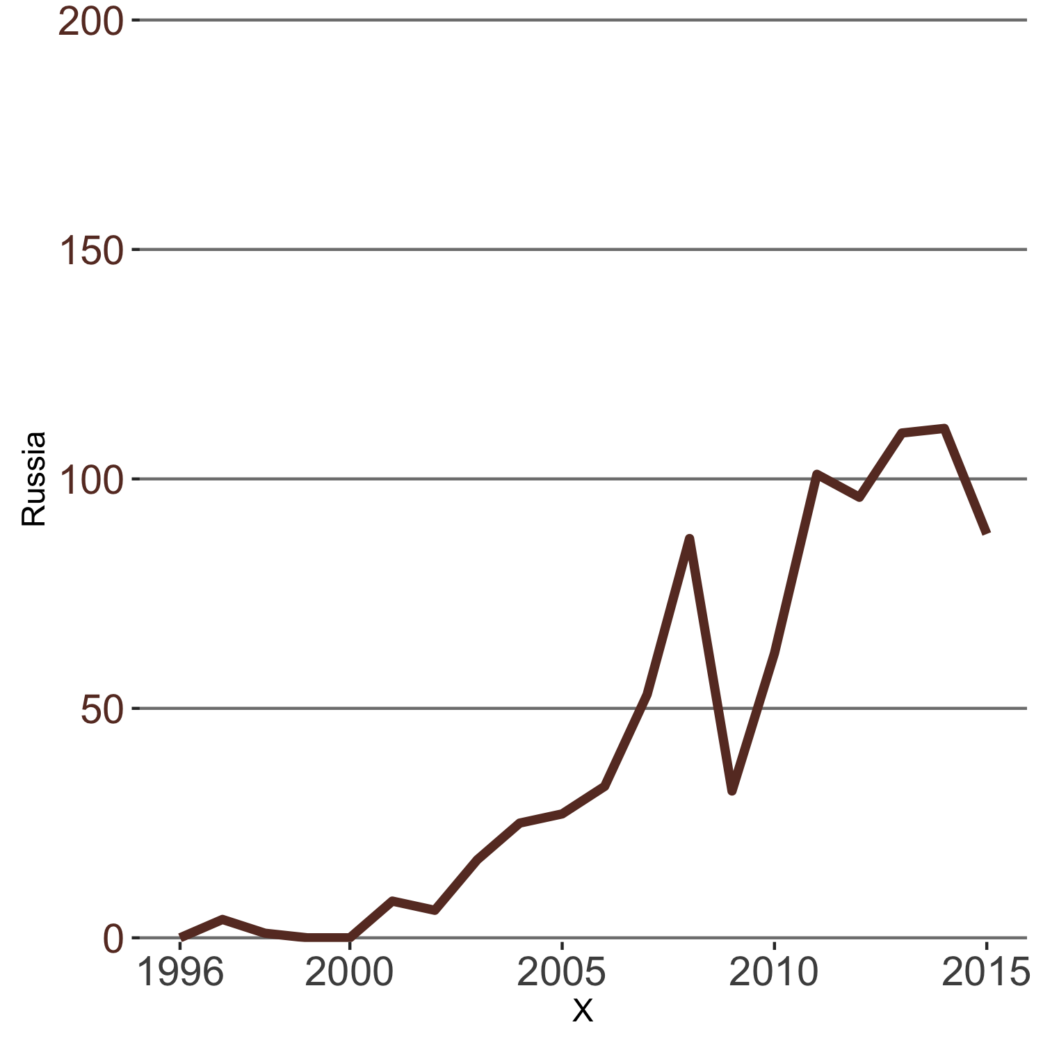
Axis ticks
The axis tick marks are also a bit too short, and we don’t need any of them on the y-axis. axis.ticks are theme items so setting the following parameters will effect these changes. Note that the unit function sets the length of the tick marks and is part of the grid package.
p1 <- p1 +
theme(axis.ticks.length = unit(.25, "cm"),
axis.ticks.y = element_blank())
Axis title
The x-axis title is redundant, so we can remove them. The y-axis title should be moved to the top with proper orientation. However, ggplot2 does not allow the y-axis title to be positioned like that, so we’re going to abuse the plot title to make that happen, while disabling the axis title. Note that the color of the pseudo-axis-title has to match the color of the data line as well, i.e. “brown”. The appearance of plot title can be changed by setting the plot.title theme item with element_text().
p1 <- p1 + ggtitle("Number in Russia\n") + labs(x=NULL, y= NULL)
theme(plot.title = element_text(hjust = -0.16, vjust=2.12, colour="#68382C", size = 14))
The newline character (\n) is used to create a vertical space between the title and the plot panel.
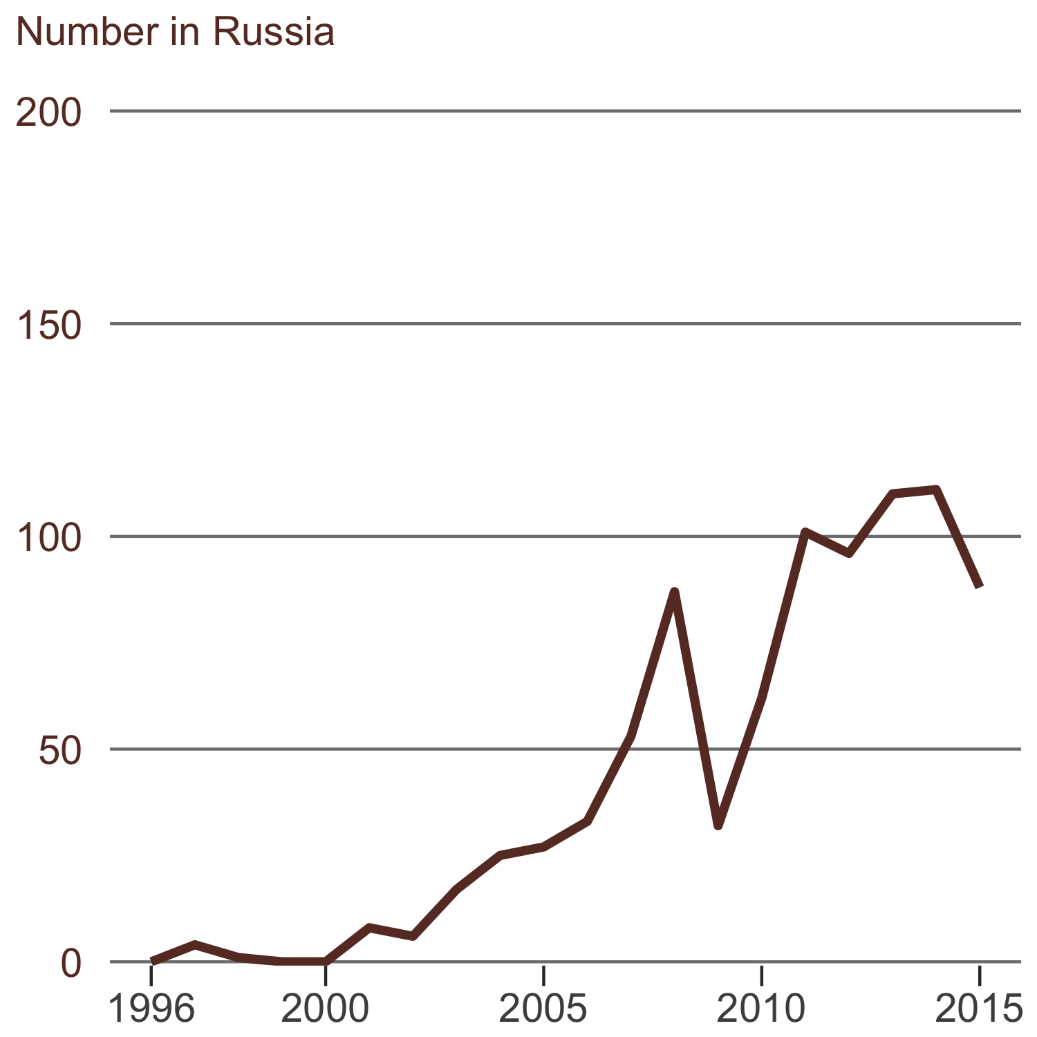
This looks good, but the font is still the default Helvetica. The extrafont package will let us use whichever font we like. The Officina Sans font that The Economist uses is a commercial font which is available here. After installing the font on your machine, you need to import the font to the extrafont database and register it with R. This step must be done once whenever you start a new R session.
font_import()
fonts() # view available fonts
loadfonts()
After the font is registered with R, we can use it in our ggplot by setting the font family in element_text() as follow
p1 <- p1 + theme(text = element_text(family="ITCOfficinaSans LT Book"),
plot.title = element_text(hjust = -0.135, vjust=2.12, colour="#68382C", size = 14, family = "OfficinaSanITCMedium"))
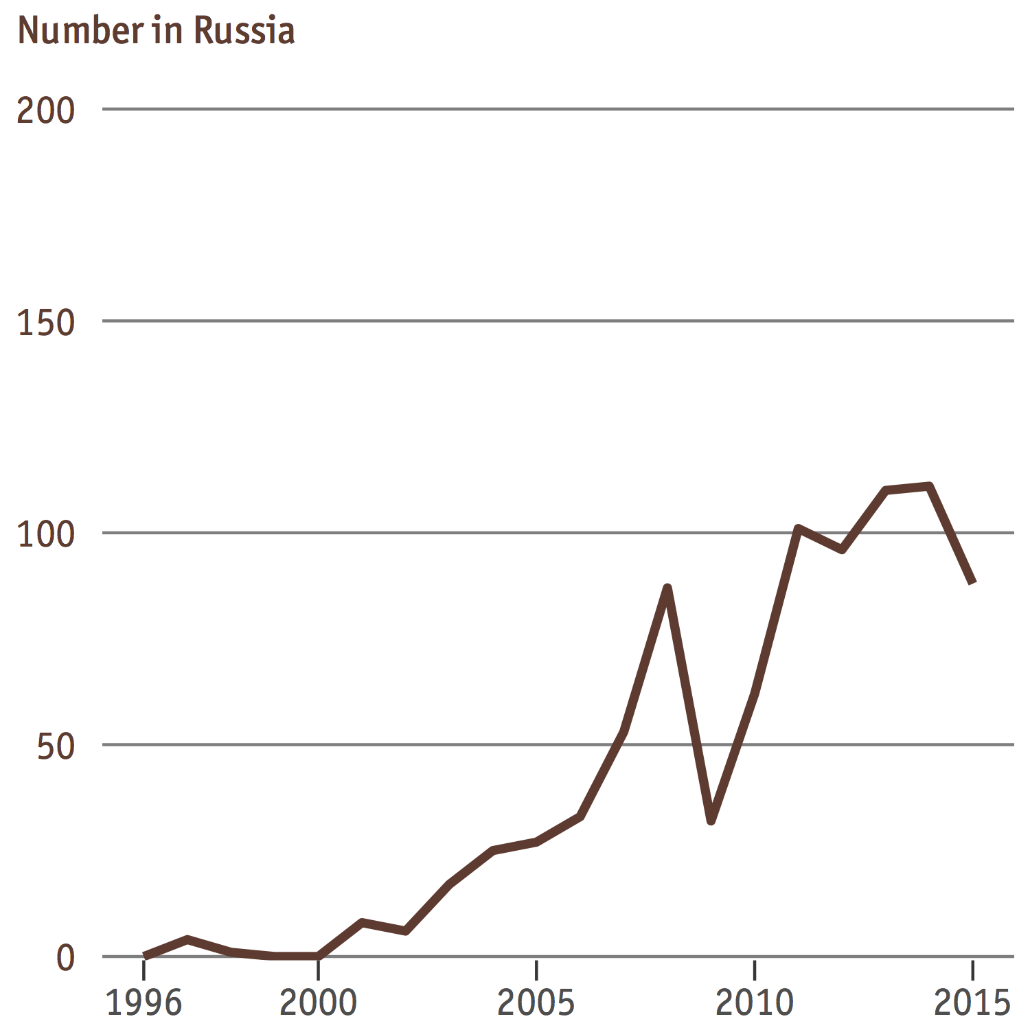
This looks pretty close to the original chart!
Now let’s review and consolidate all pieces of code we have written in one place. Interestingly, ggplot2 syntax allows us to write theme(x = ...) + theme(y = ...) as theme(x = ..., y = ...), which we can use to tidy up our code. The end result will look something like this:
p1 <- ggplot(rus, aes(X, Russia)) +
geom_line(colour = "#68382C", size = 1.5) +
ggtitle("Number in Russia\n") +
labs(x=NULL,y=NULL) +
scale_x_continuous(breaks= c(1996, seq(2000,2015,5))) +
scale_y_continuous(expand = c(0, 0), limits = c(-0.9,200.9)) +
theme(
panel.background = element_blank(),
panel.grid.minor = element_blank(),
panel.grid.major = element_line(color = "gray50", size = 0.5),
panel.grid.major.x = element_blank(),
text = element_text(family="ITCOfficinaSans LT Book"),
axis.text.y = element_text(colour="#68382C", size = 14),
axis.text.x = element_text(size = 14),
axis.ticks = element_line(colour = 'gray50'),
axis.ticks.length = unit(.25, "cm"),
axis.ticks.x = element_line(colour = "black"),
axis.ticks.y = element_blank(),
plot.title = element_text(hjust = -0.135, vjust=2.12, colour="#68382C", size = 14, family = "OfficinaSanITCMedium"))
Create line plot for rest-of-the-world data
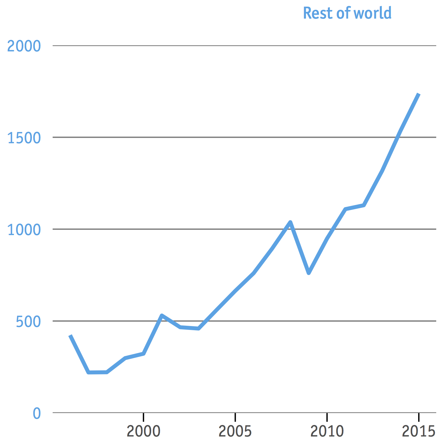
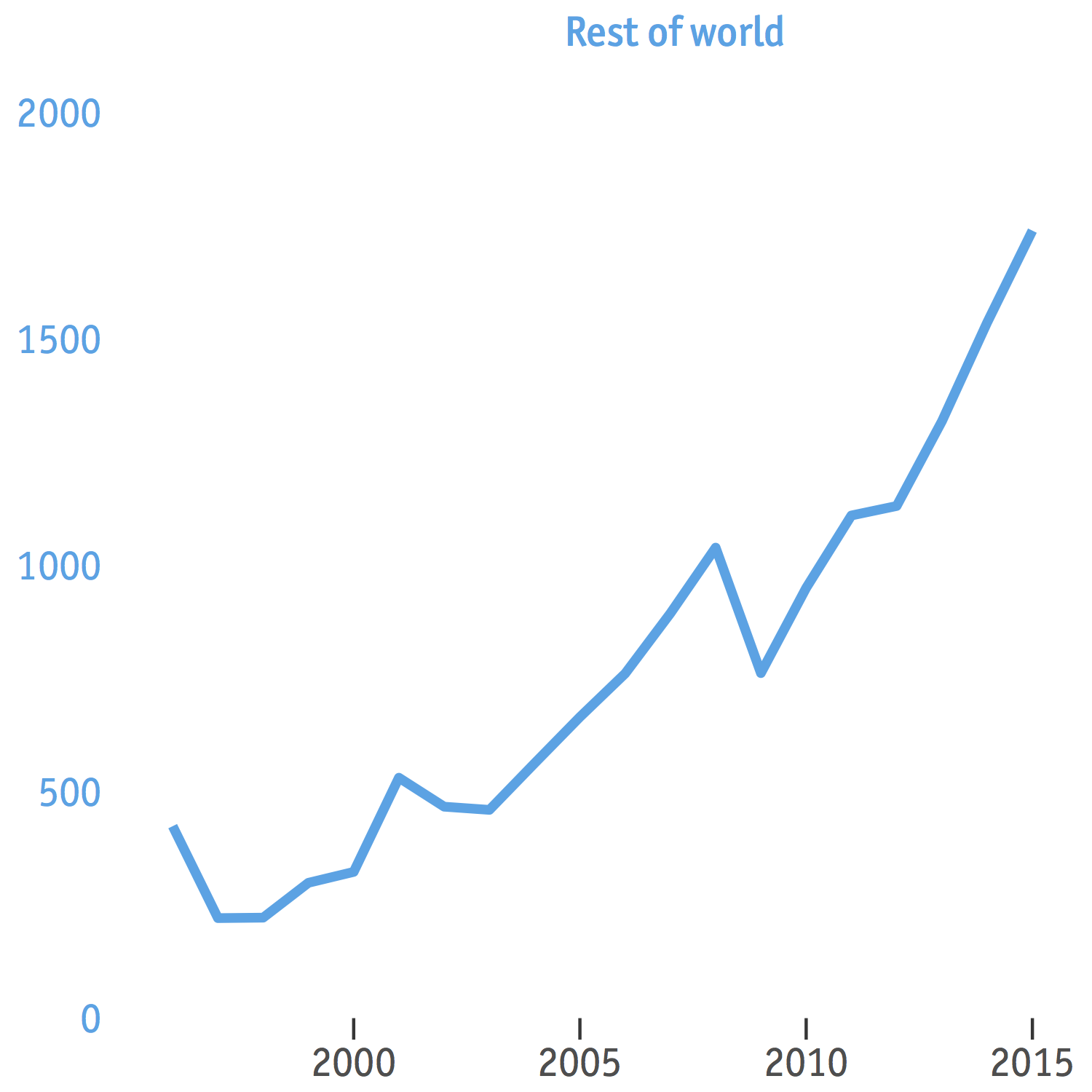
We will re-use the piece of code above, with some minor changes in color and y-axis scale. We postpone aligning the text “Rest of world” horizontally at the moment since later we are going to flip the y-axis to the right side and would have to do it anyway, so any value of hjust would do.
p2 <- ggplot(world, aes(X, World)) +
geom_line(colour = "#00A4E6", size = 1.5) +
ggtitle("Rest of world\n") +
labs(x=NULL,y=NULL) +
scale_x_continuous(breaks= c(1996, seq(2000,2015,5))) +
scale_y_continuous(expand = c(0, 0), limits = c(-0.9,2000.9)) +
theme(
panel.background = element_blank(),
panel.grid.minor = element_blank(),
panel.grid.major = element_line(color = "gray50", size = 0.5),
panel.grid.major.x = element_blank(),
text = element_text(family="ITCOfficinaSans LT Book"),
axis.text.y = element_text(colour="#00A4E6", size=14),
axis.text.x = element_text(size = 14),
axis.ticks = element_line(colour = 'gray50'),
axis.ticks.length = unit(.25, "cm"),
axis.ticks.x = element_line(colour = "black"),
axis.ticks.y = element_blank(),
plot.title = element_text(hjust = 0.85, vjust=2.12, colour = "#00a4e6", size = 14, family = "OfficinaSanITCMedium"))
Combine the two plots
Solution 1: Kohske’s method - may not work with ggplot2 version 2.1.0 and later.
This solution draws on code from here by Kohske. Basically what it does is to decompose p2 into two parts, one is the y-axis and the other is everything else on the main panel. The latter is superimposed on p1, then the former is flipped horizontally and added to the right side of it. To get all the innards of a ggplot you can use the functions ggplot_gtable and ggplot_build. The ggplot_build function outputs a list of data frames (one for each layer of graphics) and a panel object with information about axes among other things. The ggplot_gtable function, which takes the ggplot_build object as input, builds all grid graphical objects (known as “grobs”) necessary for displaying the plot. To manipulate the gtable output from ggplot_gtable, you need the gtable package.
# make gtable objects from ggplot objects
# gtable object shows how grobs are put together to form a ggplot
g1 <- ggplot_gtable(ggplot_build(p1))
g2 <- ggplot_gtable(ggplot_build(p2))
# get the location of the panel of p1
# so that the panel of p2 is positioned correctly on top of it
pp <- c(subset(g1$layout, name == "panel", se = t:r))
# superimpose p2 (the panel) on p1
g <- gtable_add_grob(g1, g2$grobs[[which(g2$layout$name == "panel")]], pp$t,
pp$l, pp$b, pp$l)
# extract the y-axis of p2
ia <- which(g2$layout$name == "axis-l")
ga <- g2$grobs[[ia]]
ax <- ga$children[[2]]
# flip it horizontally
ax$widths <- rev(ax$widths)
ax$grobs <- rev(ax$grobs)
# add the flipped y-axis to the right
g <- gtable_add_cols(g, g2$widths[g2$layout[ia, ]$l], length(g$widths) - 1)
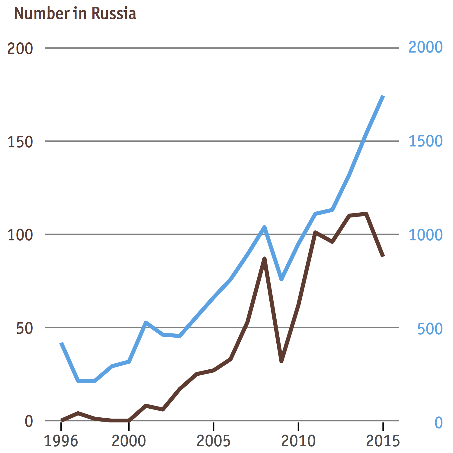
g <- gtable_add_grob(g, ax, pp$t, length(g$widths) - 1, pp$b)Now g is no longer a ggplot, but a gtable. To plot it on R’s default graphic device you can use grid.draw(g) or to print it to a PDF graphic device, ggsave("plot.pdf",g, width=5, height = 5).
The text “Rest of world” is missing, but we’ll come to that later. What also doesn’t look right is how the horizontal gridlines are sitting on top of the “brown” data line. This is because we have put every component of the panel of p2, including the gridlines, onto the plot of p1. However, since some of these are already present in p1, it doesn’t make sense to include them in p2. Hence we’ll revise the code that creates p2 to leave out components such as horizontal gridlines cause they don’t contribute to the overall aesthetics except making the chart more cramped. We need to retain the x-axis texts and x-axis tick marks, however, to keep p1 and p2 in relative position with each other.
p2 <- ggplot(world, aes(X, World)) +
geom_line(colour = "#00A4E6", size = 1.5) +
ggtitle("Rest of world\n") +
labs(x=NULL,y=NULL) +
scale_y_continuous(expand = c(0, 0), limits = c(-0,2000.9)) +
theme(
panel.background = element_blank(),
panel.grid.minor = element_blank(),
panel.grid.major = element_blank(),
text = element_text(family="ITCOfficinaSans LT Book"),
axis.text.y = element_text(colour="#00A4E6", size=14),
axis.text.x = element_text(size=14),
axis.ticks.length = unit(.25, "cm"),
axis.ticks.y = element_blank(),
plot.title = element_text(hjust = 0.6, vjust=2.12, colour = "#00a4e6", size = 14, family = "OfficinaSanITCMedium"))
And after merging
We’re now only a few steps away from the original chart. The text “Number in Russia” has mysteriously shifted some pixels to the right after the merge and the other text, “Rest of world”, has disappeared altogether. To get them back in their place we need to fiddle with the gtable structure of g again. Specifically, we must find out where information about the title such as text content, color, and position is stored in g. Once we know that we can change the information however we want. But this might take some time because figuring out what grob contains the title is not easy. Sometimes your best bet is to print out every grob to a separate page in PDF and investigate.
A not little bit of trial and error told me the axis title is located at g$grobs[[8]]$children$GRID.text.1767$. From here I can make my changes
# change text content
g$grobs[[8]]$children$GRID.text.1767$label <- c("Number in Russia\n", "Rest of world\n")

# change color
g$grobs[[8]]$children$GRID.text.1767$gp$col <- c("#68382C","#00A4E6")

# change x-coordinate
g$grobs[[8]]$children$GRID.text.1767$x <- unit(c(-0.155, 0.829), "npc")
I don’t know why this is so, but the number location of GRID.text i.e. 1767, may not be the same each time we make a plot. To make sure you get the correct location everytime, type g$grobs[[8]]$children into the console and see what number it returns. Also the horizontal coordinates c(-0.155,0.829) of the texts are found by trial and error and may not work well everytime. Now let’s see what we’ve got here
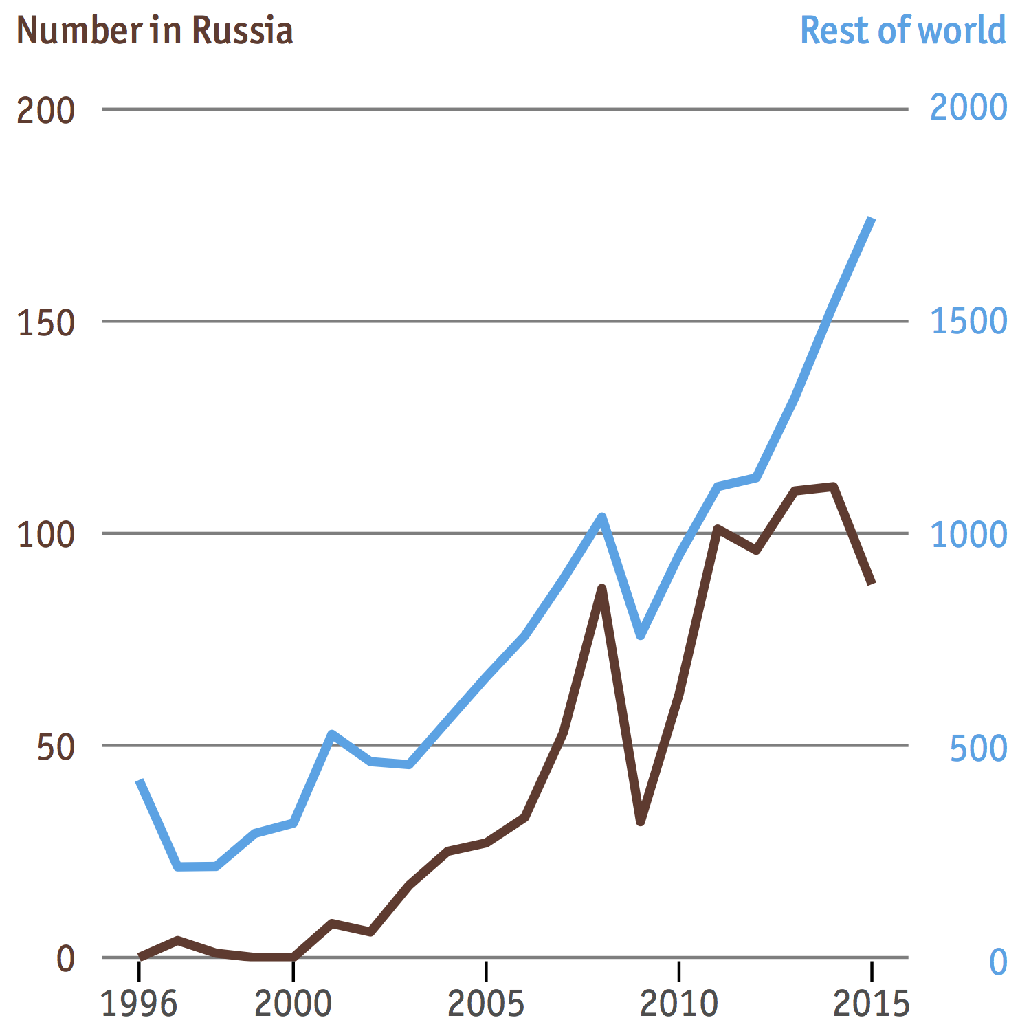
… and how it compares to the original
Except the trunctuated dates on the x-axis that I see no point in attempting to reproduce since we are abundant in horizontal space, this is a very close match. However, there are still two things that bother me:
- The tick labels on the right y-axis are not left justified as in the original rendering. The base R
graphicsare not customizable enough to fix this. - There is still a tiny little space between the tick marks on the x-axis and the bottommost gridline. (Yes, I didn’t forget you, space!)
Solution 2: Sandy’s method - tested to work with gglot2 version 2.1.0
I posted a question on stackoverflow the day before about how to get the text “Rest of world” to display after combining p1 and p2 à la Kohske’s method because I had no idea how to do it at the time. And Sandy Muspratt has just kindly provided me with a solution that is much better than my own as it requires less hardcoding when it comes to positioning the axis titles, and also addresses the two problems I mentioned above. Thank you, Sandy!
The philosophy behind this solution is almost the same as Kohske’s, that is to access the ggplot object at the grob level and make changes from there. The only difference between the two solutions is due to the difference in structure between a ggplot produced by different versions of ggplot2 package.
The code below is copied almost verbatim from Sandy’s original answer on stackoverflow, and he was nice enough to put in additional comments to make it easier to understand how it works. We only need to make some slight changes to the font family and text position to match The Economist theme. Also this solution will add the axis title after the separate plots are combined together, so make sure to comment out ggtitle() for both p1 and p2.
# Get the plot grobs
g1 <- ggplotGrob(p1)
g2 <- ggplotGrob(p2)

# Get the locations of the plot panels in g1.
pp <- c(subset(g1$layout, name == "panel", se = t:r))

# Overlap panel for second plot on that of the first plot
g1 <- gtable_add_grob(g1, g2$grobs[[which(g2$layout$name == "panel")]], pp$t, pp$l, pp$b, pp$l)

# ggplot contains many labels that are themselves complex grob;
# usually a text grob surrounded by margins.
# When moving the grobs from, say, the left to the right of a plot,
# make sure the margins and the justifications are swapped around.
# The function below does the swapping.
# Taken from the cowplot package:
# https://github.com/wilkelab/cowplot/blob/master/R/switch_axis.R
hinvert_title_grob <- function(grob){

# Swap the widths
widths <- grob$widths
grob$widths[1] <- widths[3]
grob$widths[3] <- widths[1]
grob$vp[[1]]$layout$widths[1] <- widths[3]
grob$vp[[1]]$layout$widths[3] <- widths[1]

# Fix the justification
grob$children[[1]]$hjust <- 1 - grob$children[[1]]$hjust
grob$children[[1]]$vjust <- 1 - grob$children[[1]]$vjust
grob$children[[1]]$x <- unit(1, "npc") - grob$children[[1]]$x
grob
}

# Get the y axis from g2 (axis line, tick marks, and tick mark labels)
index <- which(g2$layout$name == "axis-l")  # Which grob
yaxis <- g2$grobs[[index]]                  # Extract the grob

# yaxis is a complex of grobs containing the axis line, the tick marks, and the tick mark labels.
# The relevant grobs are contained in axis$children:
#   axis$children[[1]] contains the axis line;
#   axis$children[[2]] contains the tick marks and tick mark labels.

# Second, swap tick marks and tick mark labels
ticks <- yaxis$children[[2]]
ticks$widths <- rev(ticks$widths)
ticks$grobs <- rev(ticks$grobs)

# Third, move the tick marks
# Tick mark lengths can change.
# A function to get the original tick mark length
# Taken from the cowplot package:
# https://github.com/wilkelab/cowplot/blob/master/R/switch_axis.R
plot_theme <- function(p) {
plyr::defaults(p$theme, theme_get())
}

tml <- plot_theme(p1)$axis.ticks.length   # Tick mark length
ticks$grobs[[1]]$x <- ticks$grobs[[1]]$x - unit(1, "npc") + tml

# Fourth, swap margins and fix justifications for the tick mark labels
ticks$grobs[[2]] <- hinvert_title_grob(ticks$grobs[[2]])

# Fifth, put ticks back into yaxis
yaxis$children[[2]] <- ticks

# Put the transformed yaxis on the right side of g1
g1 <- gtable_add_cols(g1, g2$widths[g2$layout[index, ]$l], pp$r)
g1 <- gtable_add_grob(g1, yaxis, pp$t, pp$r + 1, pp$b, pp$r + 1, clip = "off", name = "axis-r")

# Labels grob
left = textGrob("Number in Russia", x = 0, y = 0.9, just = c("left", "top"), gp = gpar(fontsize = 14, col =  "#68382C", fontfamily = "OfficinaSanITCMedium"))
right =  textGrob("Rest of World", x = 1, y = 0.9, just = c("right", "top"), gp = gpar(fontsize = 14, col =  "#00a4e6", fontfamily = "OfficinaSanITCMedium"))
labs = gTree("Labs", children = gList(left, right))

# New row in the gtable for labels
height = unit(3, "grobheight", left)
g1 <- gtable_add_rows(g1, height, 2)

# Put the label in the new row
g1 = gtable_add_grob(g1, labs, t=3, l=3, r=5)

# Turn off clipping in the plot panel
g1$layout[which(g1$layout$name == "panel"), ]$clip = "off"

# Print to PDF
ggsave("plot.pdf", g1, width=5, height=5)
This is what it looks like
… and compared to the original again
Wrap-up
This looks at first a simple chart to make, but it turns out to be one of those complex charts that requires knowledge of gtable since this is not standard in gglot2. For those who are looking for a tl;dr, I’ve put all the steps together into a single code, which can be found here.
Finally, the point isn’t that you can mimic other styles. It’s that there’s enough flexibility to create your own. This doesn’t just apply to R but to other tools such as Excel or whatever software having a reputation for producing horrible graphics. With some customization and tweaks, you can leave the default settings behind and create awesome-looking charts.