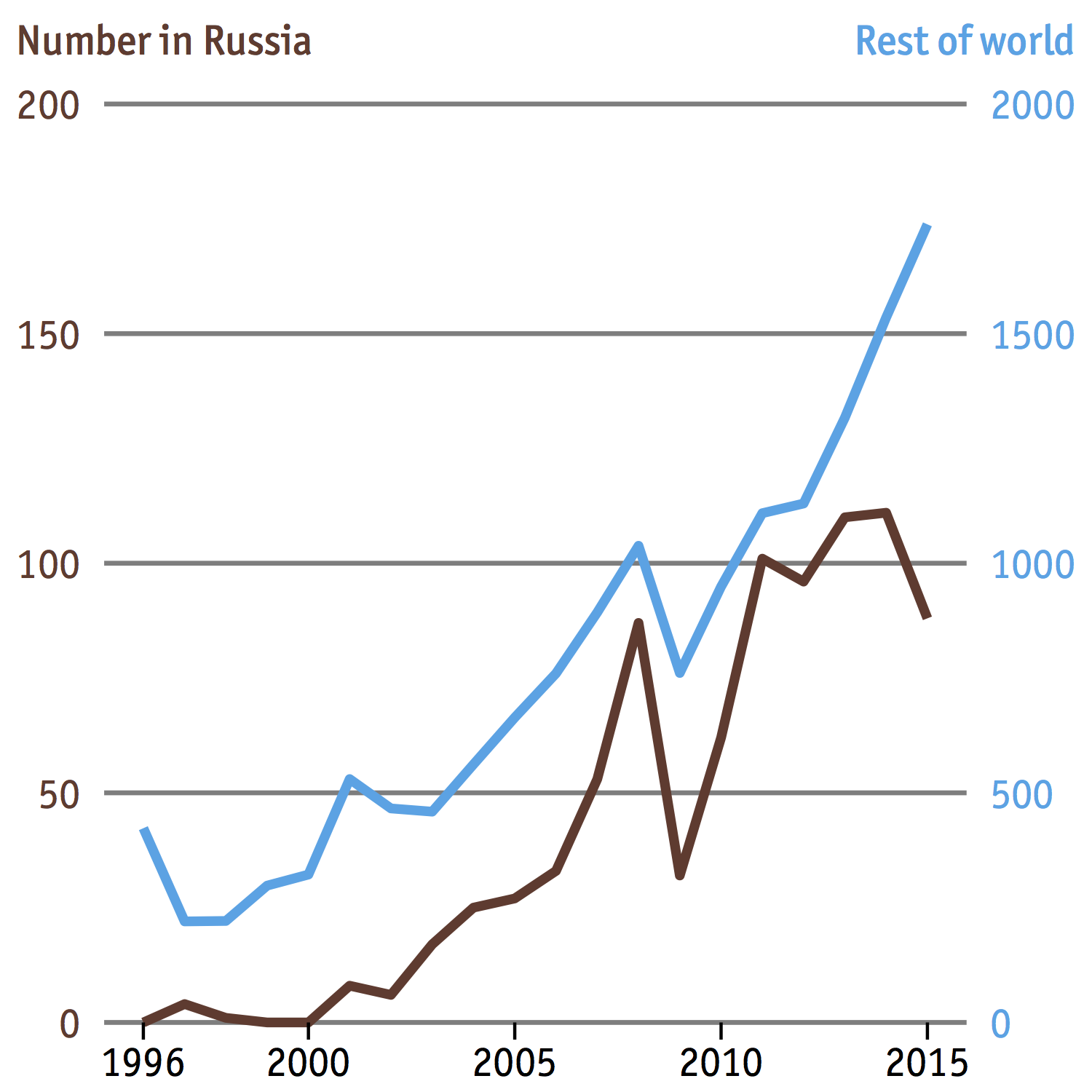
In a previous post we demonstrated how to add a secondary y-axis to a line plot in ggplot2 by recreating a chart from The Economist. But if you examine the chart more closely you will see that we left out the grey borders surrounding the plot, and also the top and bottom captions.

Can we do something about it? Absolutely, and the easiest way is probably to export the chart to PDF and continue editing in a vector graphic editor like Inkscape or Illustrator. But if you’re a complete R fanatic like me and would like to do everything in R then read on, because I’m going to show you how to do that. However, be warned that it’s going to take some time as ggplot2 doesn’t let you make any changes outside the plot area.
What we need is the gtable package which I have mentioned briefly in this post. Basically it lets you view and manipulate ggplot layouts containing graphic elements, or grobs; if you think of a ggplot as a jigsaw then each jigsaw piece represents a grob. In fact I already used gtable to add the axis titles (“Number in Russia” and “Rest of world”) in that dual y-axis plot, but never explained how and why it worked. I’m going to do that now.
Initial plot
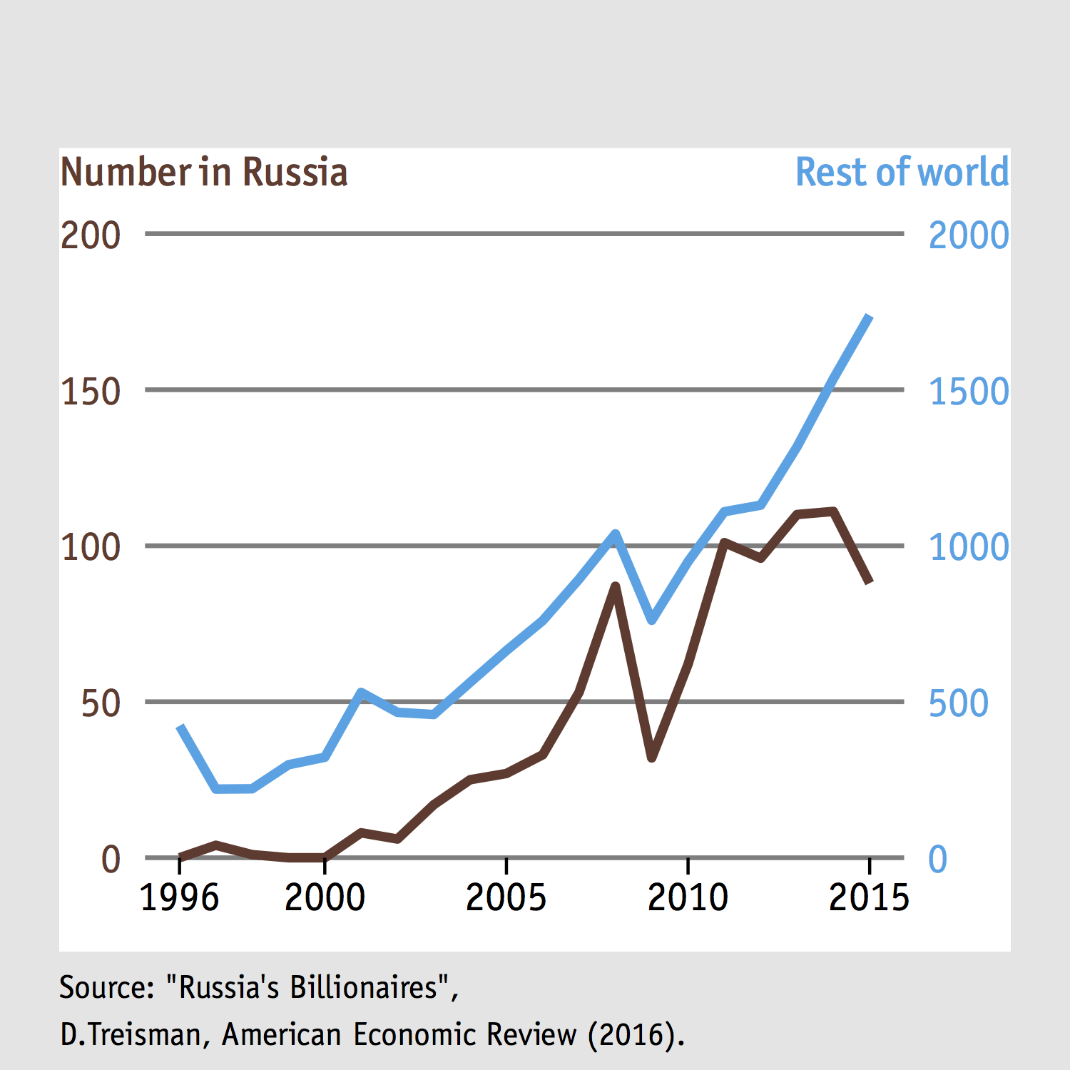
Let’s revisit this plot from a previous post
This is a gtable object (g1) and we already know how to create it. If we want to make it look like the one at the beginning of this post then we need to add some borders and some texts, and in that order because otherwise the texts will be obscured by the borders.
Add borders
Let’s start by seeing what the matrix layout of g1 looks like
g1## TableGrob (7 x 6) "layout": 11 grobs
## z cells name grob
## 1 0 (1-7,1-6) background rect[plot.background..rect.4204]
## 2 3 (4-4,3-3) axis-l absoluteGrob[GRID.absoluteGrob.4199]
## 3 1 (5-5,3-3) spacer zeroGrob[NULL]
## 4 2 (4-4,4-4) panel gTree[GRID.gTree.4186]
## 5 4 (5-5,4-4) axis-b absoluteGrob[GRID.absoluteGrob.4193]
## 6 5 (6-6,4-4) xlab zeroGrob[axis.title.x..zeroGrob.4200]
## 7 6 (4-4,2-2) ylab zeroGrob[axis.title.y..zeroGrob.4201]
## 8 7 (2-2,4-4) title zeroGrob[plot.title..zeroGrob.4202]
## 9 8 (4-4,4-4) layout gTree[GRID.gTree.4214]
## 10 9 (4-4,5-5) axis-r absoluteGrob[GRID.absoluteGrob.4227]
## 11 10 (3-3,3-5) layout gTree[GRID.gTree.4235]That’s a lot of information but we only need to take note of the position of the background, or the plot canvas. It covers cells 1-7 in the y-axis, and cells 1-6 in the x-axis. Now for the grey borders, you can think of them as four grey rectangles attached to the margins of the plot. To create such a rectangle, we’ll use the function rectGrob.
# grey filling with no border line
rect = rectGrob(gp = gpar(col = NA, fill = "grey90"))
Why didn’t I specify the dimensions of rect? Because it’s an infinite canvas that fills the (plot) cell it occupies, and not a bounded regular rectangle. That’s why we only needed to create one such “rectangle”, and not four. Now our job is to pad it to the top, bottom, left, and right of the plot. To do this we’ll use the function ggtable_add_grob.
# add to the left and right
for(i in c(1,6)) g1 = gtable_add_grob(g1, rect, t = 1, b = 7, l=i)
# add to the top and bottom
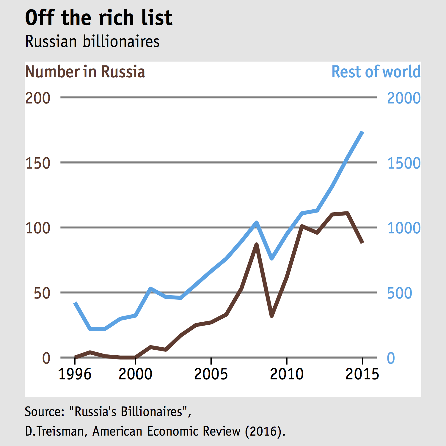
for(i in c(1,7)) g1 = gtable_add_grob(g1, rect, t = i, l = 1, r=6)If the numbers 1,6, and 7 look familiar to you, then you’re right. These are the x- and y-coordinates of the background. Let’s see if we did it right
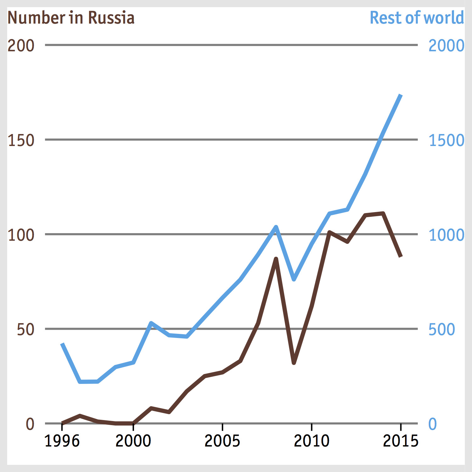
Yes we did! There are grey borders running around the plot, but they are too narrow. This is because we didn’t set any plot margins when making p1 (and eventually g1). So let’s go back to this post and fix that - all you need to do is specify the margin widths in plot.margin:
p1 <- ggplot(rus, aes(X, Russia)) +
geom_line(colour = "#68382C", size = 1.5) +
#ggtitle("Number in Russia\n") +
labs(x=NULL,y=NULL) +
scale_x_continuous(breaks= c(1996, seq(2000,2015,5))) +
scale_y_continuous(expand = c(0, 0), limits = c(0,200)) +
theme(
panel.background = element_blank(),
panel.grid.minor = element_blank(),
panel.grid.major = element_line(color = "gray50", size = 0.75),
panel.grid.major.x = element_blank(),
text = element_text(family="ITCOfficinaSans LT Book"),
axis.text.y = element_text(colour="#68382C", size = 14),
axis.text.x = element_text(size = 14, colour = "black"),
axis.ticks = element_line(colour = 'gray50'),
axis.ticks.length = unit(.2, "cm"),
axis.ticks.x = element_line(colour = "black"),
axis.ticks.y = element_blank(),
panel.border = element_blank(),
plot.margin = unit(c(50, 20, 40, 20), "pt"))
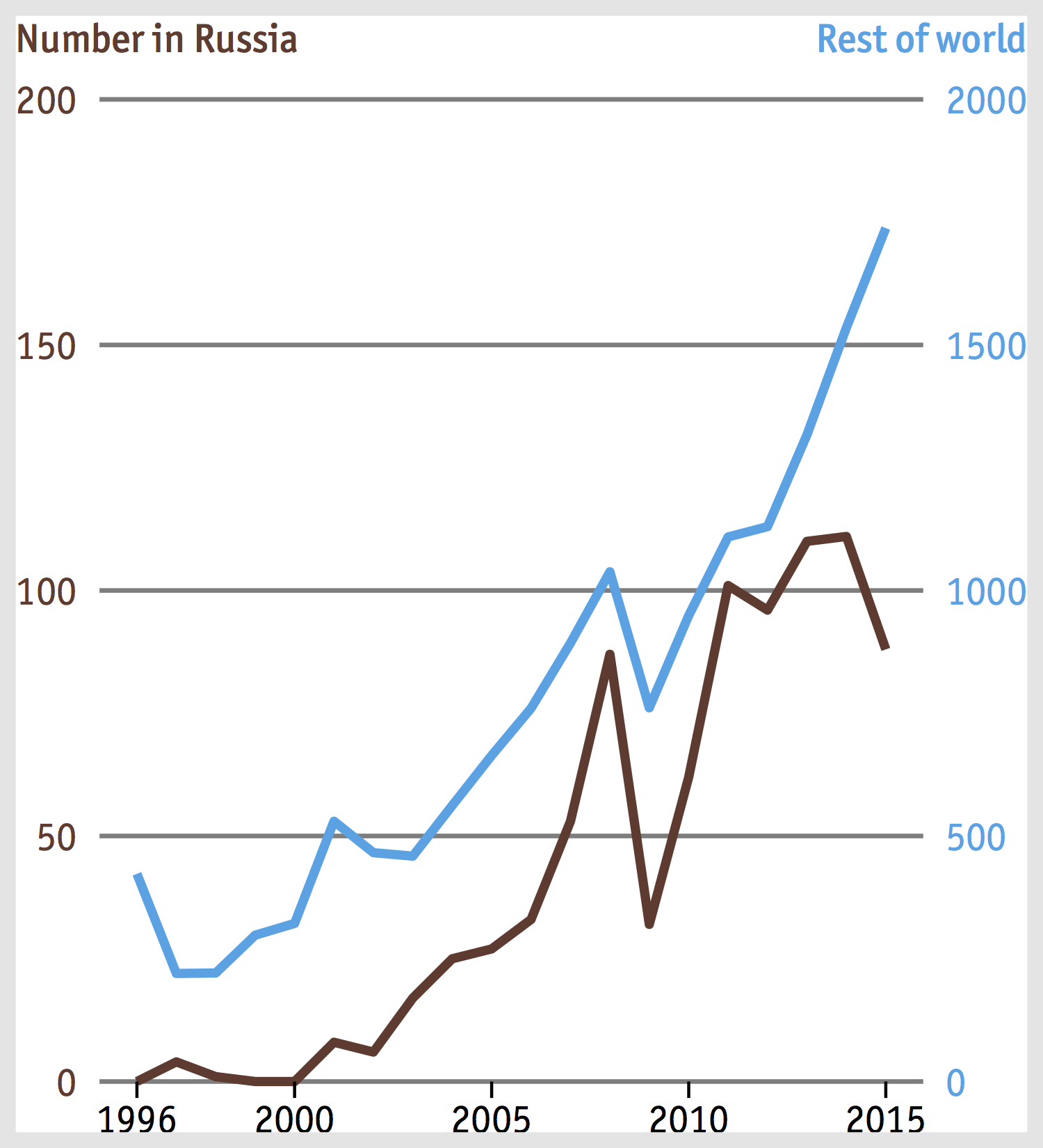
There’s a problem, though: the bottom border touches the x-axis tick labels and I don’t think it looks nice. This is not due to the rect grob itself, however, but because we removed all space under the tick labels by setting labs(x=NULL). Hence we’ll use labs(x="") instead. While labs(x="") only suppresses the display of the axis title and leaves a blank space in its place, labs(x=NULL) removes that space altogether.
# ...
labs(x="",y=NULL)
# ...
Add texts
Bottom caption: Data source
We’ll start by adding the bottom caption first since it’s easier. Although there are two lines of text, they are of the same regular font face and size, so a string with a newline character \n would do the job. Just as we used rectGrob() to create a filled background, we’re going to use textGrob() to draw text, which is then converted into a grob by gTree().
left.foot = textGrob("Source: \"Russia's Billionaires\",\nD.Treisman, American Economic Review (2016).",
x = 0, y = 0.8, just = c("left", "top"),
gp = gpar(fontsize = 11, col =  "black", fontfamily = "ITCOfficinaSans LT Book"))
labs.foot = gTree("LabsFoot", children = gList(left.foot))
Now we need to figure out where to put labs.foot on our plot. A quick look at the layout of g1 suggests
g1 <- gtable_add_grob(g1, labs.foot, t=7, l=2, r=4)
Top caption: Title and subtitle
The texts on top are a little trickier to add since they are of different size and font face. First we’ll make a grob for each line of text using textGrob() and gTree(), as we did earlier.
left.title = textGrob("Off the rich list", x = 0, y = 0.9, just = c("left", "top"), gp = gpar(fontsize = 18, col =  "black", fontfamily = "ITCOfficinaSans LT Bold"))
labs.title = gTree("LabsTitle", children = gList(left1))

left.sub = textGrob("Russian billionaires", x = 0, y = 0.9, just = c("left", "top"), gp = gpar(fontsize = 14, col =  "black", fontfamily = "ITCOfficinaSans LT Book"))
labs.sub = gTree("LabsSub", children = gList(left.sub))
The next step is to combine the grobs into a gtable using gtable_matrix()
left.head = matrix(list(left.title, left.sub), nrow = 2)
head = gtable_matrix(name = "Heading", grobs = left.head,
widths = unit(1, "null"),
heights = unit.c(unit(1.1, "grobheight", left.title) + unit(0.5, "lines"), unit(1.1,  "grobheight", left.sub) + unit(0.5, "lines")))
Finally we can put the gtable at the top of our current plot
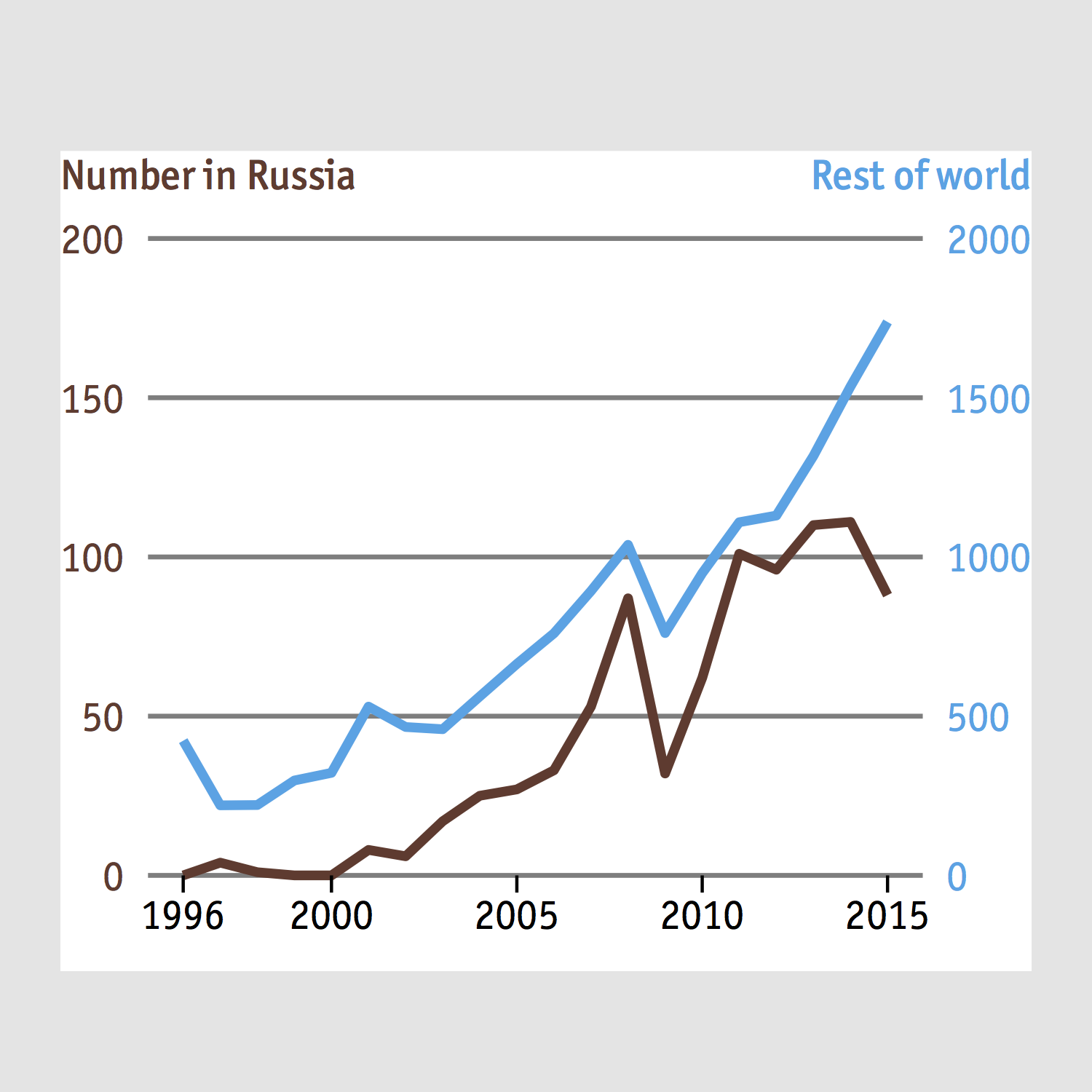
g1 <- gtable_add_grob(g1, head, t=1, l=2, r=4)… and voilà
This already looks great to me, but if you want a more exact replica of the original chart, then there are two things you need to do
- Reduce the left and right borders.
- Italicize the text “American Economic Review”.
The first can be done easily by changing the margin in plot.margin(). The second takes a bit more effort, as the text in italic is only part of a sentence. That’s where the function expression() and paste() come in handy.
expression(paste("D.Treisman, ", italic("American Economic Review")," (2016)."))Depending on the available font faces of the font family you are choosing, you can also use bold() or bolditalic(). Now, since the line above it is almost of the same font styling, a natural next step is to use a \n to join them into a single string, like this
expression(paste("Source: \"Russia's Billionaires\",\nD.Treisman ", italic("American Economic Review")," (2016)."))However, this is not going to work because of some incompatibility between expression() and the new line character. A solution is to make a text grob for each line and combine them into a gtable, like what we did with the title and subtitle.
left.foot.1 = textGrob("Source: \"Russia's Billionaires\",", x = 0, y = 0.8, just = c("left", "top"), gp = gpar(fontsize = 12, fontfamily = "ITCOfficinaSans LT Book"))
labs.foot.1 = gTree("LabsFoot1", children = gList(left.foot.1))

left.foot.2 = textGrob(expression(paste("D.Treisman, ", italic("American Economic Review")," (2016).")), x = 0, y = 0.8, just = c("left", "top"), gp = gpar(fontsize = 12, fontfamily = "ITCOfficinaSans LT Book"))
labs.foot.2 = gTree("LabsFoot2", children = gList(left.foot.2))

left.foot = matrix(list(left.foot.1, left.foot.2), nrow = 2)
labs.foot = gtable_matrix(name = "Footnote", grobs = left.foot,
widths = unit(1, "null"),
heights = unit.c(unit(1.1, "grobheight", left.foot.1) + unit(0.5, "lines"), unit(1.1,  "grobheight", left.foot.2) + unit(0.5, "lines")))
Here’s what the end result looks like
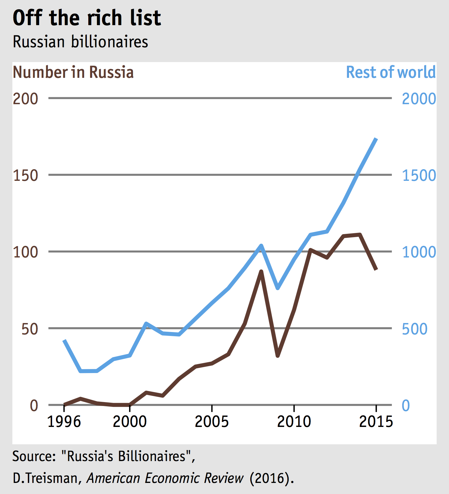
To conclude this post, let’s see how it compares to the original chart
As usual, here’s the complete code: code. Also if you plan to include this in your markdown document, make sure to add the following chunk to your code to get the font embedded
grid.draw(g1)
embed_fonts("demo.pdf", outfile="demo_embed.pdf")
A demo pdf can be found here.